Project Profile:
Chuckwalla Digital
In-house rebrand and website redesign supporting a growing, SEO-focused digital marketing agency.
Background
This project was a ground-up rebrand and website redesign completed in my role as in-house designer and developer for a long-standing digital marketing agency.
The previous site had served the business well for over a decade, but no longer reflected the agency’s growth or evolving focus on SEO-driven strategy. While functional, it had become visually dated and difficult to navigate. The goal of the redesign was to create a clearer, more modern experience that aligned with the agency’s current capabilities and future direction.
Scope
Website | Brand Package | Logo | Marketing Materials | Iconography
Building the Brand
The project began with a new logo and color palette inspired by the company’s namesake, the chuckwalla lizard. Resilient, distinctive, and native to the Southwest, the chuckwalla reflects both the agency’s roots and durability.
Real Chuckwalla
Old Logo
New Logo
Credit: Los Angeles Zoo
Visual Strategy
In an industry saturated with cut-and-paste templates, my goal was to create something clearly bespoke while still aligning with established expectations in digital marketing. I wanted the brand to stand apart without feeling unfamiliar.
Colors
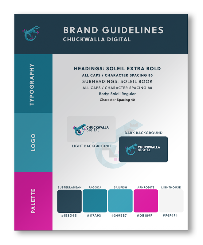
Turquoise was a natural anchor for the palette, grounding the brand in its Southwestern context. Bright fuchsia - adapted from the agency’s original color scheme - was introduced as a bold counterpoint. The combination felt unexpected within the tech and marketing space, which was precisely the appeal, giving the agency instant recognizability across the website, marketing materials, and even branded swag.
Assets
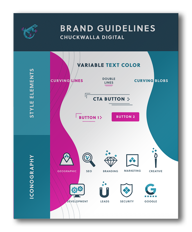
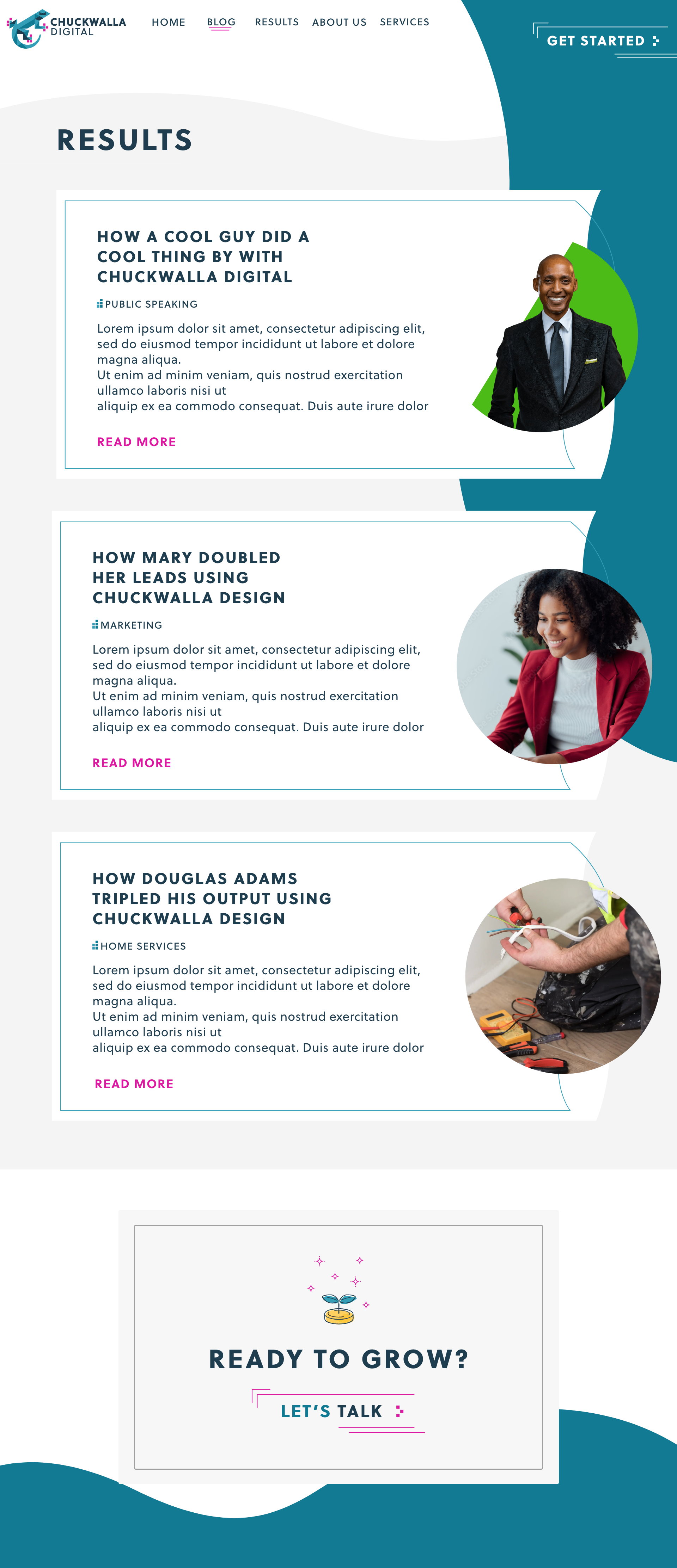
I created organic, curving forms that offered flexibility and visual energy. These shapes help guide attention toward key content and translate seamlessly into subtle animations on the website. A pixel motif was woven into both the logo and custom iconography, quietly reinforcing the agency’s technical foundation while tying the system together visually.
Website
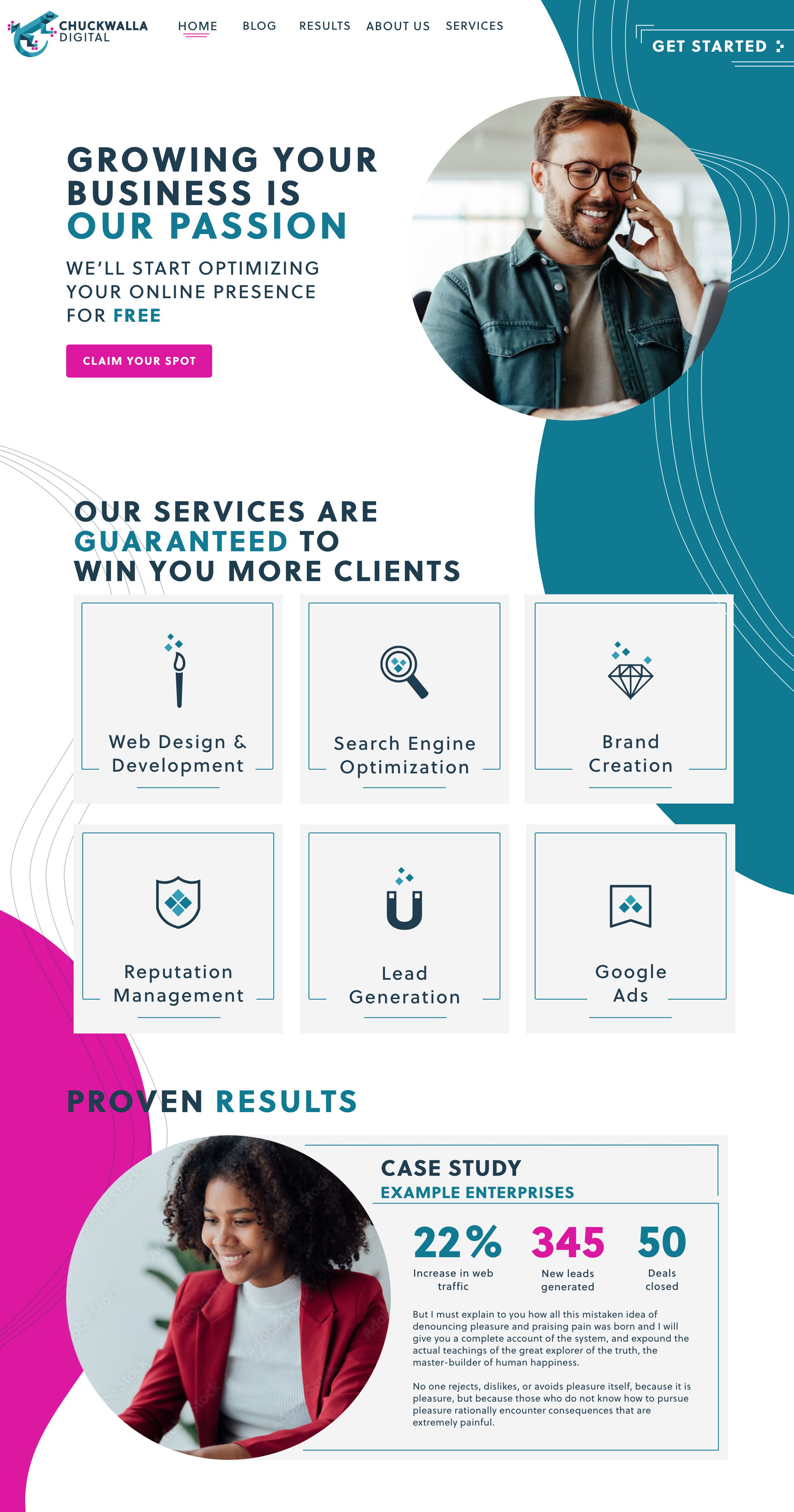
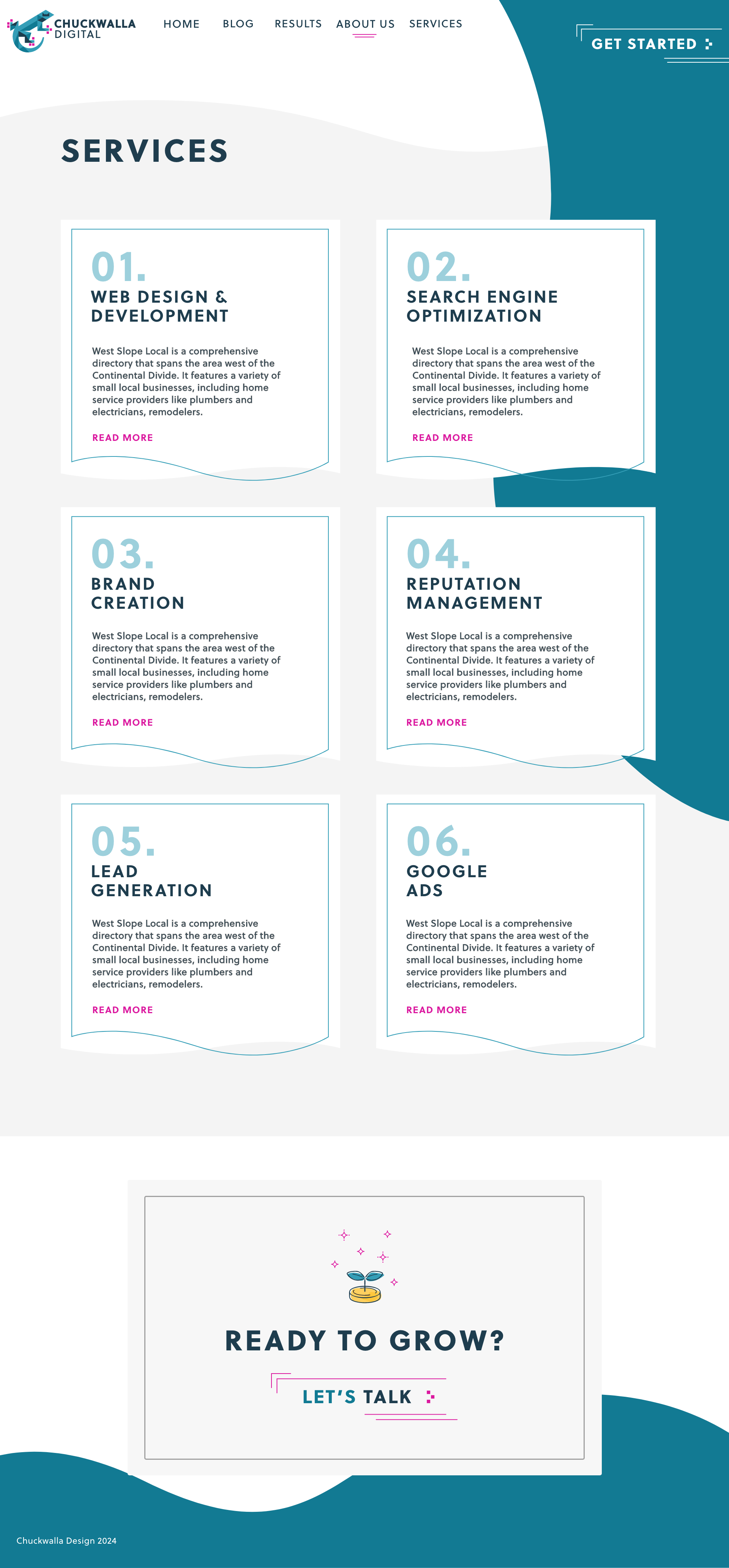
The website was designed to support both clarity and conversion, making it easy for visitors to quickly understand services and take action. Clear service cards highlight return-on-investment metrics, supported by case studies and client reviews that build credibility and trust. A dedicated blog was incorporated to support ongoing SEO efforts, while streamlined calls to action—paired with a Calendly integration on every page—remove friction and make booking conversations simple and intuitive.


