
Project Profile:
639 La Brea
A branding and marketing project created to build community support for a mixed-use housing development in Los Angeles County, clearly communicating the value of affordable housing in a region deeply impacted by the housing crisis.
Background

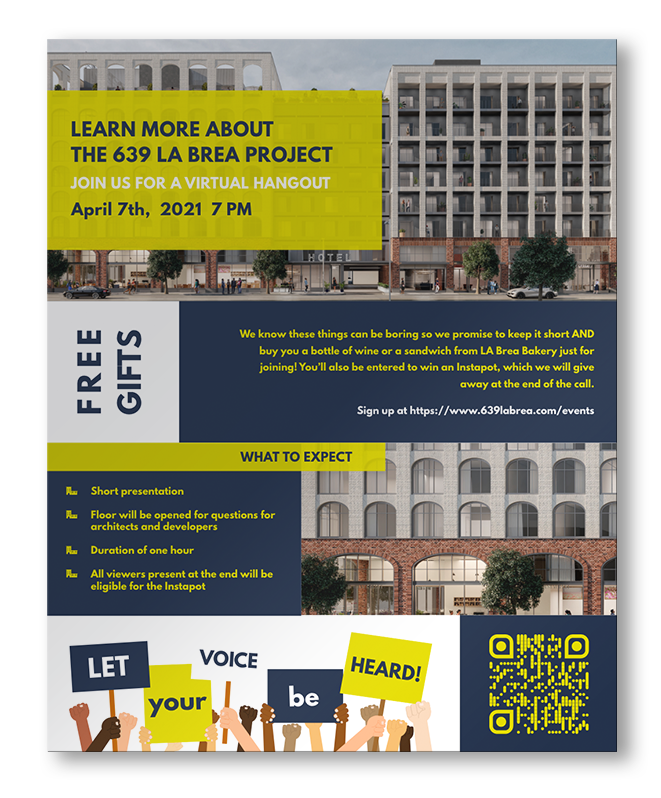
The scope of this project included the development of a complete visual identity and outreach system to support community engagement efforts around the proposed development. This work encompassed brand development, a custom website, original iconography, and a suite of coordinated digital and print marketing materials designed for public-facing communication.
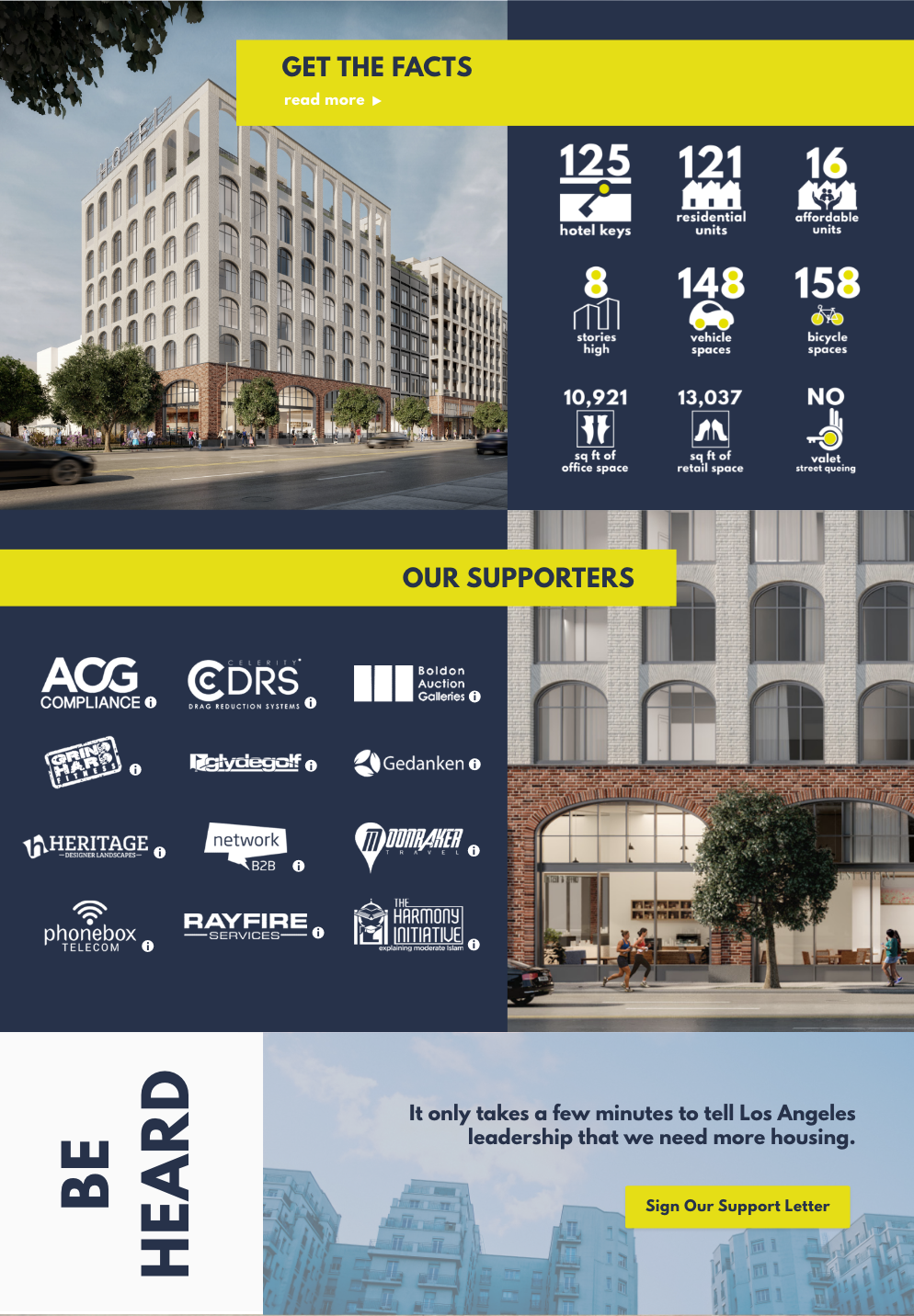
Particular emphasis was placed on clarity and accessibility, ensuring that complex information about the project - especially the inclusion of affordable housing - could be easily understood by a broad audience.
Scope
Website | Brand Package | Logo | Iconography | Marketing Materials
Building the Brand

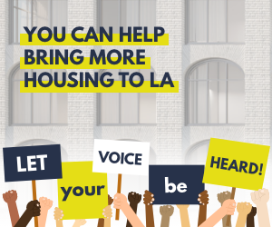
The visual identity for 639 La Brea centered on creating a bold, attention-grabbing visual system that could cut through a crowded civic landscape. A commanding all-caps typographic style, strong color blocking, and simple, high-contrast elements were used to ensure the messaging was clear and immediately legible.
Colors
The palette centers on navy and citron, chosen to feel grounded yet optimistic. Navy nods to Los Angeles’s coastal context, while citron brings energy and high visibility to community-facing materials. The success of the project earned the palette a second life here in my own portfolio.


Assets
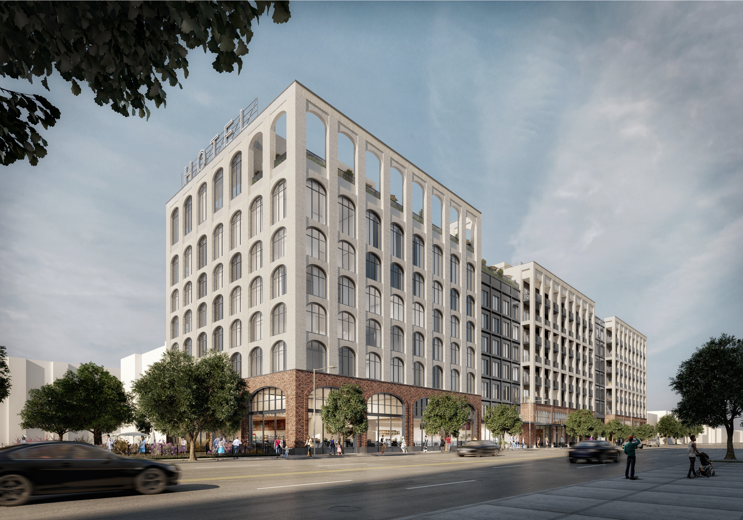
The visual assets were designed to be bold, simple, and immediately recognizable. The logo takes the form of a straightforward rectangle, echoing the geometry of the building. Color blocking, robust icons, and high-contrast compositions were used throughout to ensure legibility and impact across digital and print materials, creating a system that feels confident, direct, and easy to deploy.
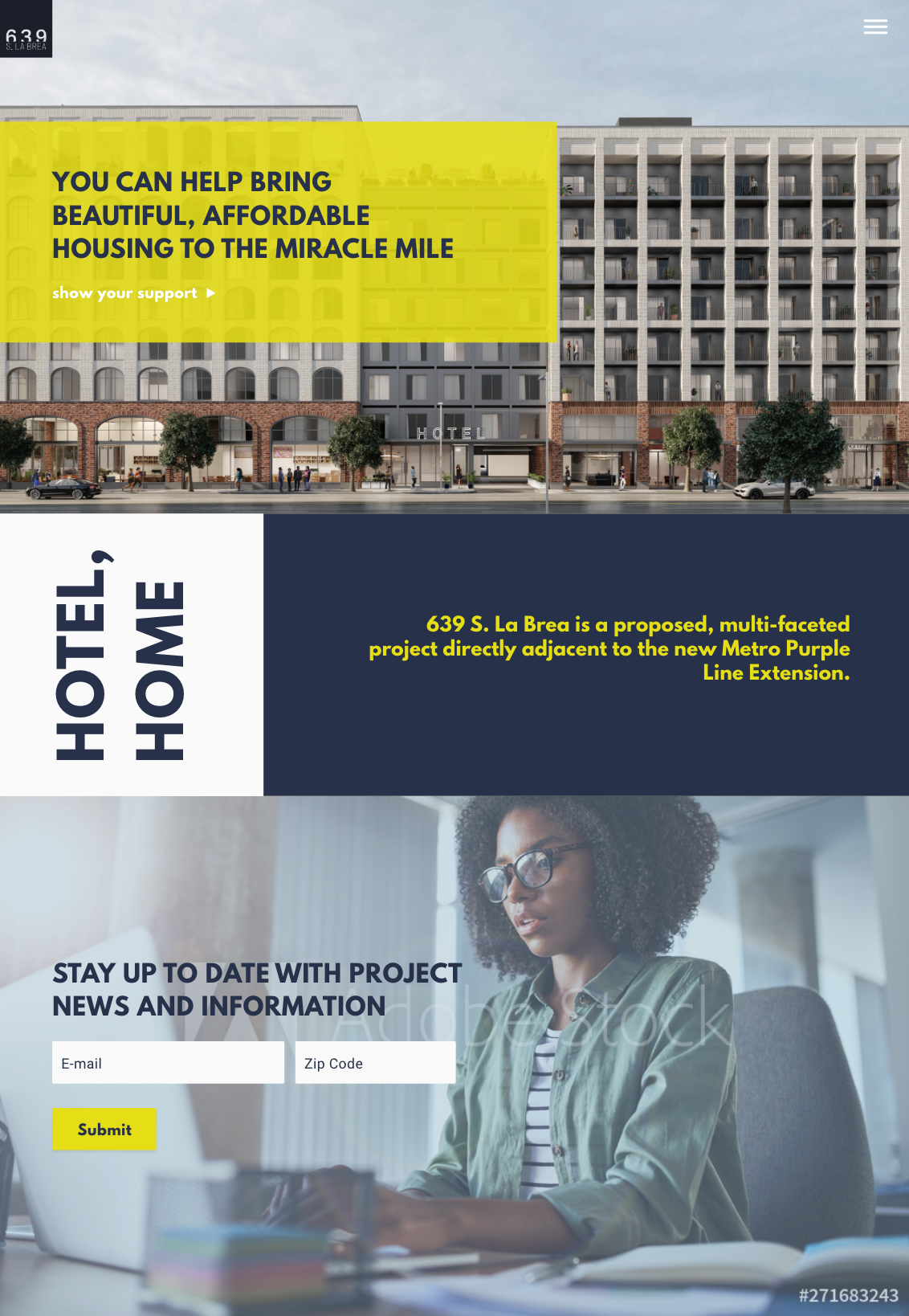
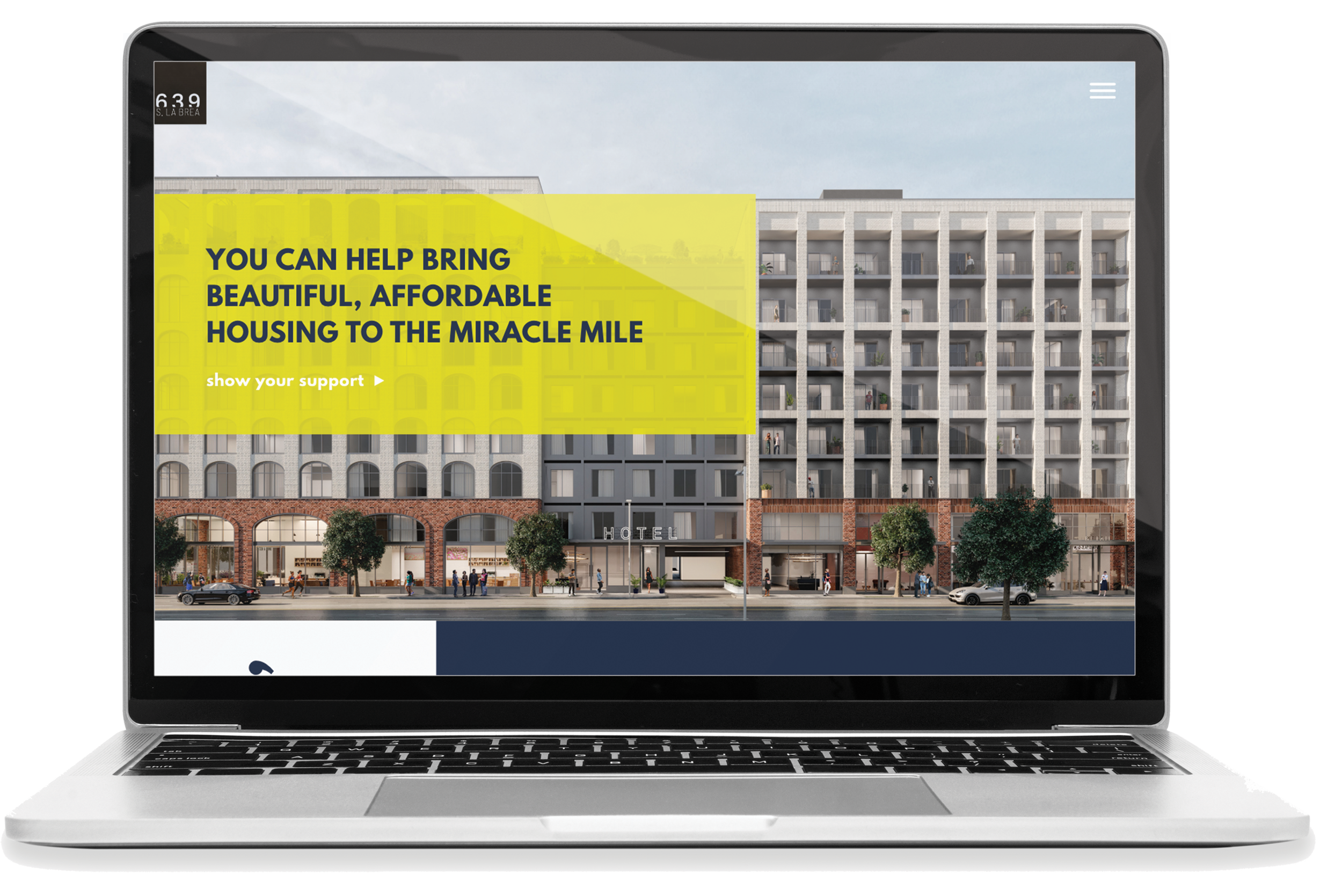
Website
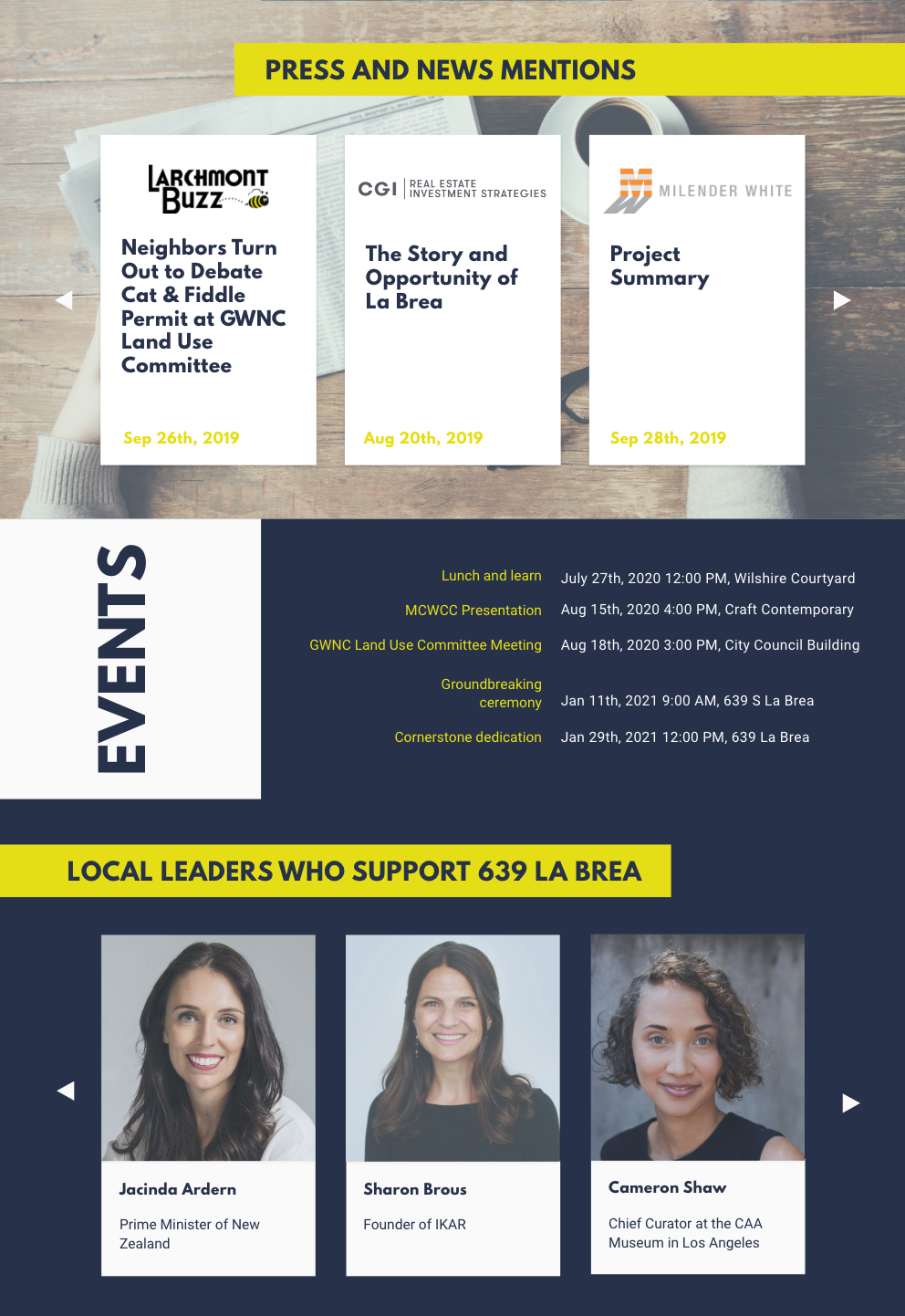
The website was designed as a focused, single-page experience tasked with conveying a substantial amount of information in a clear and digestible way. Because the project required presenting complex development details within a streamlined format, easy-to-read graphics and strong visual hierarchy were essential. The layout prioritizes clarity and flow, guiding visitors through key information efficiently while maintaining visual engagement.